Top 19 tips for an on-trend home this autumn, according to interior designers
As the days turn cooler, leisure time is increasingly spent indoors. To maximise your enjoyment of the autumn months, top interior designers from across Britain share their trend tips for the season. From a new style in metallics to taking inspiration from the weather, these are the styles that will take your home to the next level for autumn 2016.
1. Colour inspiration from the weather
“As the nights draw in, cosy becomes key,” says Kate Harris of Kate Harris Interior Design. "Take a good look at the nature around you, the rich berries, the darkening skies, the orange and reddening hues of leaves that are dropping from trees. All these autumnal colours are warm, rich and comforting; take inspiration from them for your colour palette. Using them in your accessories adds an instant injection of warmth.
Some designers still love dark colours, but Kate thinks that grey has had its day. “For those who simply can’t bear to lose this colour, look for grey tones warmed up with softer shades – ‘greige’ will be around for a while to come. I predict coral with become a big trend, too.”
2. Splurge on sofa style
What should your statement piece of the season be? “This season I would splash out on a little luxury in the sitting room by adding cushions and throws on the sofa,” says Jane Cappleman of Jane Cappleman Interior Design.
“They do not only bring comfort and warmth, but as the nights draw in they add a splash of colour. Changing cushions every couple of years helps to keep your room up to date and looking fresh without spending too much money.”

3. Unusual autumn colours
There is more to autumn than the deep red colour of fallen leaves. “Orange is particularly fab for autumn – taking inspiration from the changing colours outside, it adds a zap of colour that blends in with the majority of schemes really easily,” says Anna Ward from Furnished By Anna.
“This year will have a strong yellow tone added to it with ochre becoming a real on trend colour. The strong mustardy tone works really well to bring in an almost gold shade to schemes.
“Pink is having a moment and can be used in varying tones to create different ambiences and atmospheres. Dusky pinks are just beautifully warm and classic, mixed with ochre and grey they are a real winner for this autumn.”
4. Base colour to change with the season
“With grey being a base palette that most people now have in their homes, the introduction of a colour can lift the space and add visual interest,” advises Samantha Morphew of Morph Designs.
“Green tones from emerald to chartreuse can be used to accessorise your home, from a cushion, candle, photo frame or, for the more daring, an upholstered product such as a chair or sofa.
"With the backdrop of grey, a coloured furniture piece can really pop and stand out as a feature.
"Coloured glass used in table lamp bases have been another great way of introducing colour and complimenting a room palette. Lamps are not fixed and can be moved so I find most people are becoming more adventurous when colour is involved."

5. Geometrics
“This year has seen a lot of geometric designs used for tiles, fabrics and wallpapers and they are set to continue into next year,” notes Traci Horton of Poppi Interiors.
“Injecting something into your home for whatever the reason, maybe to add a splash of colour, can be done with little expense. A colourful piece of artwork, cushions in bold fabrics or a statement piece accessory can bring the room to life again.”
6. Let there be light
With less light available each day, it’s important to make the most of the light that we get. Richard Bond of Jamie Hempsall Interiors has some tips.
“Reflection is the key way to amplify both your natural and electric light over the coming months – not to mention your good mood! We often talk about the importance of using mirrors to help bounce light into areas that might otherwise be dark. This can be achieved not only from a simple wall hung mirror, but also by the inclusion of reflective materials in the surfaces of ornaments and furniture throughout the area.”
“If this sounds like a dusting and finger-mark nightmare, or you have concerns that it might feel brash, you can tone down the overall effect by opting for églomisé finishes, rather than the clear mirror.
“Verre églomisé is a production technique where glass is gilded on the back with gold or metal leaf. It provides subtle, muted reflection. The technique has been around for centuries and was particularly popular in the 18th Century, but is experiencing a renaissance.
“When incorporated onto a bedside table the finish works particularly well as it reflects back light from any lamps placed upon them (and it doesn’t show marks so much, avoiding constantly having to polish for a perfect finish). One of my favourite examples is the Temple Bedside from Julian Chichester (from £1,217 at www.julianchichester.com - it may sound a chunk of investment, but build quality means these should be antiques of the future).”

7. Gloss vs. matt
“Matt finishes appear to be taking over from high gloss, as seen at Paris' Maison and London's Decorex design shows this season,” notes Lauren Matthews, Director of Lauren Matthews Interiors. “Kitchen and joinery cupboard doors finished in a semi sheen instead of high gloss are beginning to become more mainstream. Team matt finishes with a semi-sheen or high gloss to add variation and interest to a scheme.
“On the shiny side, metallics are still very on trend, particularly warm, rose bronze and copper. Consider introducing small, rose-bronze trays to layer glassware or ornaments."
8. Light and layers
“Autumn always brings in warmer colours and tons of texture – with clients wanting to almost bed down for the winter,” says Anna Ward of Furnished By Anna. “The Danish trend of ‘hygee’ is perfect for the colder months – with a huge emphasis on good quality lighting to illuminate the darker days and lots of candles and layers to add warmth and cosiness to rooms.
“Sheepskins, throws and shaggy rugs are all perfect for adding an extra layer to a room, creating a super cosy space that will make you eager to get in from the cold. Just adding a few of these to the room will instantly transform the space into one ready for a hot chocolate and a book. Candles can be made more special with holders from designers such as Tom Dixon diffusing the light to create beautiful patterns from the candle light.
“And it doesn’t have to be expensive either, you can just make the most of items that you need to create a new look – the piles of logs needed for a wood burner can be displayed more to make a clear definition from the warmer summer days, and adding extra quilts to beds make them tonnes more snuggly too.”
9. Change accessories
Dipti Patel-Carvell from Charisma Interior Design has some accessory ideas to bring your home into autumn. “Simply group three different size hurricane vases with chunky church candles set on bed of natural pebbles and pine cones,” she suggests. “Position the hurricane vases close to a mirror or window, especially in the evening for a fabulous reflection. The candle’s flame exudes cosy warmth and charm.”
“Why not cut down branches from your garden with juicy red berries and put them in a vase that's filled with leaves and pine cones? This is a simple way to bring the outdoors in for a colourful centrepiece and immediate facelift.
“Global craft, cane and bamboo accessories will add warmth and an exotic feel to your space. It’s been very popular and can be readily found on the high street.”
.jpg)
10. Eco chic
Suzy Maas from Maas Interiors has noticed an increase in the number of people looking to be environmentally friendly with the products they showcase at home.
“Natural colours, textures and materials are becoming more popular as people seek to get back to basics in reaction to the obsession with technology and our increased awareness of our damaged planet. Raw timbers, rattan, marble, forest greens and inky blues are particularly popular.
“Similarly, there is an interest in unique, handmade items and evidence of the artisan’s hand. I think that this is in reaction to over-consumption and mass production which leads to poor quality and lack of attention to detail.”
11. Botanical
There’s another way to bring the outside in. This time it’s with a spot of botany.
“The botanical theme continues into autumn/winter and has become more bold with heavy rich colours and bolder designs such as palm leaves and pineapples bringing a colonial feel to our homes,” says Traci Horton of Poppi Interiors.
“There’s still plenty of inspiration from nature and designs focussed around exploration, plus the botanical prints and wallpapers are still popular.
12. New twist on old styles
“This Autumn there is an explosion of colour,” says Jane Cappleman of Jane Cappleman Interior Design. “Archive designs have been given a contemporary twist by using jewel like blues, lime greens, burnt orange and saffron yellows.
“The prints are going large scale. The texture and iridescence of some of the velvets on the market reflect the exciting countries that inspired them. A good example can be seen in the new Durbar collection by Mathew Williamson for Osborne and Little.”

13. Modern wallpaper revolution
Bring your walls into 2016 with metallic or beaded papers from the latest wallpaper collections. Richard Bond from Jamie Hempsall Design explains.
“Nina Campbell has included a number of light reflective designs in her Coromandel Collection for Osborne & Little. Vignola (pictured) features an ornamental ogee trellis composed entirely of tiny beads, which provide delicate shimmer (£95 for a 10m roll, www.osborneandlittle.com). Her Gioconda design has flock on a reflective background generating subtle light seduction.
“If you fancy something more glass oriented, then Cole & Son have launched Antique Mirror in three shades (gold, “gilver” and silver). The design shows foxed metallic panels on a foil base paper: a wonderful way to create a cost effective alternative to antique mirror tiles which would be particularly effective in hallways and bathrooms (£85 for a 10m roll, www.cole-and-son.com).
“Experimentation and imagination are the key to incorporating light reflection, but the end results should reap rewards over the coming months.”

14. Being brave for blue
Pantone’s colour report for autumn 2016 includes a heavy use of blue. Lauren Matthews, Director of Lauren Matthews Interiors explains how to use it.
“The colour report recommends blues, particularly Riverside and Airy blue, which in autumn may seem strangely cold as we generally gravitate towards warmer hues, mainly reds, oranges, yellows and greens in the crisper cooler months.
“However Pantone describes both blues as 'cool yet strong hues that emphasise calm; not as serious as navy or as bright as colbalt'. Teaming the Riverside or Airy blue with copper or rose gold metallics, or using a bronze metallic lining on a blue silk lampshade will inject a vibrant contrast.”
https://www.pantone.com/fashion-color-report-fall-2016#riverside
15. Throws
“Cosy up this autumn with a 100% pure new wool fringed throw available in soft hues of grey, blue, pale pink and gold,” says Liz Perry, Interior Designer at Knight Design Interiors. “Designed perfectly to drape over sofas, occasional chairs and beds these sumptuous woven throws will offer an instant update and texture to any traditional or contemporary interior, and are sure to take your home straight through to winter; they are available through our studio from £60.”
.jpg)
16. Nordic influence
The team at interior design studio Sarah Jane Nielsen are loving the Scandi-influences for autumnal interiors, and in particular the latest colour palettes where shades of greys and blues are right on trend this season. “After visiting the London design expo Decorex, I was especially drawn to the wealth of watercolour-inspired designs in Azure tones that were on show in fabrics, wallcoverings and upholstery. At Zoffany and Ian Sanderson this calming shade was very much in evidence, whilst for those lucky enough to be able to splurge, the high-end Philip Jeffries range was stunning and could also be effective when used sparingly, either as an accent wall or to frame into panels to create your own piece of artwork.”
“Nordic influences with a rustic twist were also to be seen in the use of natural, textural stone finishes across a range of homewares items – get in on the trend for a modest outlay by installing new door handles.”
17. Votives
Liz Perry, from Knight Design Interiors has an idea to give your home a welcoming autumn glow. “These glittering glass votives with their mercury crackle finish will add an air of vintage elegance and glamour to your mantelpiece or dining table,” said Liz. “Whether used individually or collectively, these Culinary Concepts jewel-like tea light candle holders will add a warm glow to your home through the dark nights. With prices starting from £3.95 at Knight Design Interiors, you can afford to choose your favourite colours to create the perfect ambience.”
.jpg)
18. Stone lighting
“Lighting comes into its own as the nights draw in – and if you’re going to splash out on just one item this autumn, why not make it a statement lighting piece?” suggests Sarah Jane Neilsen. “Staying with stone finishes, you could invest in a drop pendant light, available now across the price ranges, right through to Porta Romana at the top end of the lighting market. We have table lamps in a stone finish available here: https://www.nielsenhouse.co.uk/shop/lighting/silvio-table-lamp/”
19. Tomato red
“Strong accent shades work well with this season’s palette, advises Sarah Jane Neilsen. “Use brilliant tomato reds to brighten up autumnal schemes or stay with the rich tones of leaves as they turn colour - rusts, gingers and warm spice will add contrast to soft greys and anthracite background colours. Warm velvet works a treat in this vibrant sofa, but can also be effective used as plains in cushions, one off chairs and paint colours.”
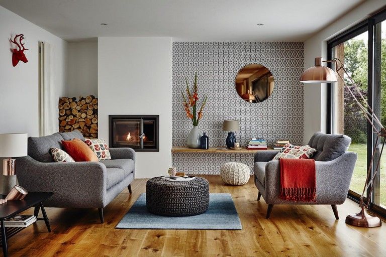
Cover image credit: Dining and Living Room
28th Sep 2016
More from Fine & Country


DISCOVER MORE ABOUT FINE & COUNTRY
NATIONAL MARKET REPORTS
Looking at selling, buying, investing or just interested in the prime property market? Read our latest edition of the National Housing Market Update.
Discover more »

SELLING YOUR PROPERTY
Selling your home is one of the most important decisions you make; your home is both a financial and emotional investment. Find out how we can help »
TAKE THEIR WORD FOR IT
An overwhelming majority of those who had used Fine & Country would recommend our services to a family member or friend, according to our most recent survey taken by members of the public.
To achieve 99.48% positive feedback is a privilege and we will endeavour to maintain this result. We are dedicated to offering the best possible services to every customer, whether buyer or seller, from beginning to end.


INDEPENDENT EXPERTISE
Every Fine & Country agent is a highly proficient and professional independent estate agent, operating to strict codes of conduct and dedicated to you. They will assist, advise and inform you through each stage of the property transaction.
GLOBAL EXPOSURE
With offices in over 300 locations worldwide we combine the widespread exposure of the international marketplace with national marketing campaigns and local expertise and knowledge of carefully selected independent property professionals.


UNIQUE MARKETING APPROACH
People buy as much into lifestyle of a property and its location as they do the bricks and mortar. We utilize sophisticated, intelligent and creative marketing that provides the type of information buyers would never normally see with other agents.
PARK LANE OFFICE
Access the lucrative London and international investor market from our prestigious Park Lane showrooms at 121 Park Lane, Mayfair. Our showrooms in London are amongst the very best placed in Europe, attracting clients from all over the world.

MULTI-AWARD WINNING
Our consistent efforts to offer innovative marketing combined with a high level of service have been recognised by the industry for an astounding fifth year in a row, winning Best International Real Estate Agency Marketing at the International Residential Property Awards.

4.85 out of 5 - based on 1988 customer reviews

OVER 300 LOCATIONS WORLDWIDE
Our International Network
Connecting offices on over 300 locations worldwide, our referral system combines local knowledge and expertise with an international network to find the right buyer for you wherever they are, at the same time as finding you your ideal next move


Our International Websites
SOCIAL MEDIA
We interact with customers on the main social media channels including Facebook, Twitter, YouTube, LinkedIn and Pinterest, giving each property maximum online exposure.
FINE & COUNTRY SERVICES
FINE & COUNTRY
INTERIOR DESIGN
Access Fine & Country Interior Design to put your property ahead and make it stand out. With expert advice from some of London’s best stylists and designers we will make sure it makes a statement. Or if you’re purchasing with us, let F&C ID help make your new house feel like home by helping you find the very best specialists and designers for property refurbishment. Find out more »


FINE & COUNTRY
FOREIGN EXCHANGE
We have partnered with Rational FX, one of the world’s leading foreign exchange specialists to provide private and tailored currency services for all of our clients buying and selling luxury property around the world. Find out how we can help »
BUYING AGENT SERVICE
We understand that your time is precious, so save the time, money and stress of searching for a property with a buying agent. Also giving you access to off-market and discreetly marketed properties.

MEDIA CENTRE
Our internal Media Centre is a team of experienced press relations managers and copy writers dedicated to liaising with newspapers, magazines and other media outlets to gain extensive coverage for our properties in national and local media.
FINE & COUNTRY PUBLICATIONS


THE FINE & COUNTRY FOUNDATION
The Fine & Country Foundation is dedicated to supporting and funding homeless causes in the UK and overseas. Fine & Country offices organise a range of fundraising events for you to get involved in and/ or support. Find out more about our work here. Read more »
*Please, note: for security reasons, the maps on this website do not provide the exact location of the property and they are provided solely as an indication of area.